Analyzing Twitter Community Networks
I’ve been obsessed with analyzing engagement networks on Twitter.
Twitter is uniquely well suited to network analysis. Anyone can mention anyone and be mentioned by anyone. The atomic unit of content, the tweet, is non-hierarchical, meaning that there’s no distinction between reply vs non-reply posts. And content is propagated primarily by social shares. And because Twitter is text-based rather than image-based, it’s become a natural discussion forum for lots of interesting communities.
The “Progress Studies” Twitter community
The network map below shows 7 Twitter communities related to “Progress Studies”. Each dot is a Twitter account. The account’s color indicates the sphere it belongs to, and its size reflects its influence.
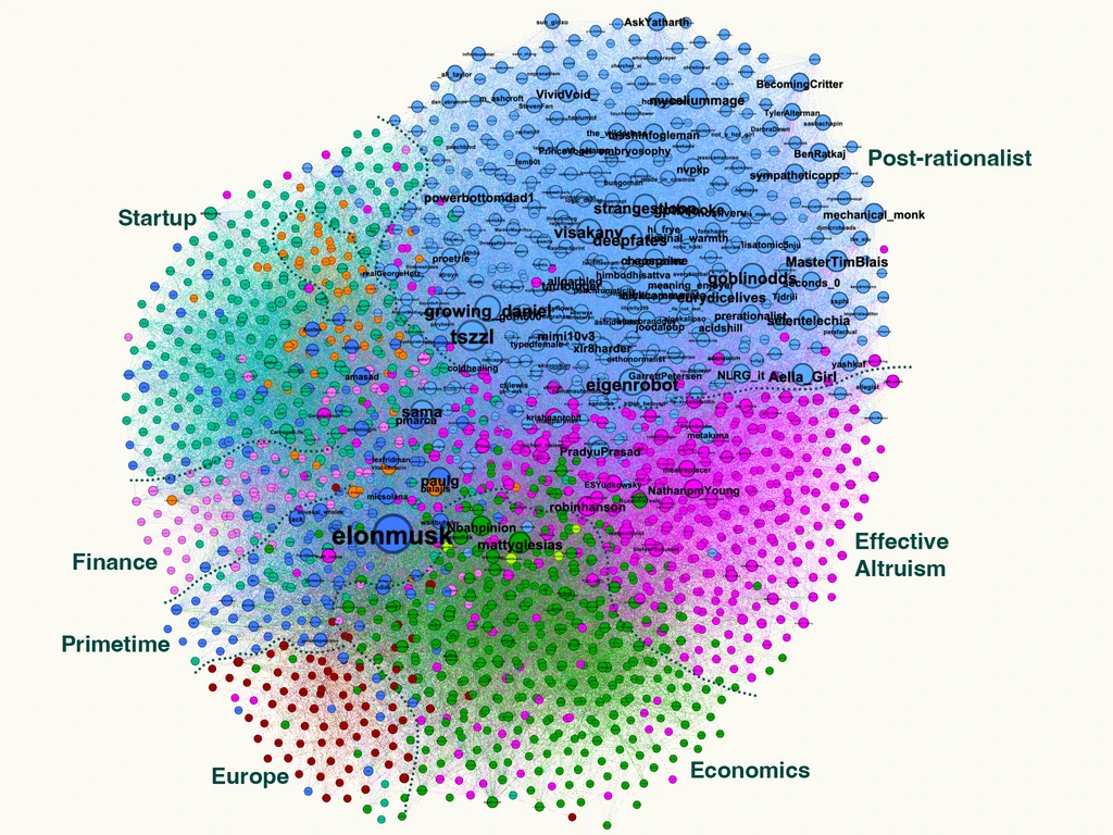 Network map of communities related to "Progress Studies".
The Economics sphere are largely academics or academic-leaning political/economic commentators.
“Europe” is, well, Europeans. Interestingly, geographic divisions consistently show up prominently in my network analyses.
“Primetime” is the cool kids table of Twitter. These are accounts that are so large (and engage mostly with each other) that they get grouped into their own community that everyone sees. They tend to be Musk-adjacent.
The “Post-rationalists” are people influenced by these other communities, but they tend to be people for whom anonymous Twitter “s—posting” is a hobby. It’s kind of hard to explain.
“Finance”, “Startup”, and “Effective Altruism” are what you expect. You may also notice some orange dots near Startup - those are crypto people.
Something else you may notice is that the largest nodes in each sphere are the most influential accounts.
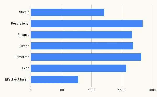
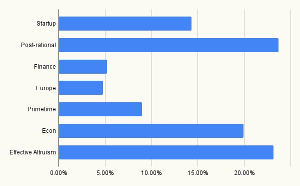 Community population (% of total)
Above, you see the population of each community as a percent of all 1,500 accounts in this visualization.
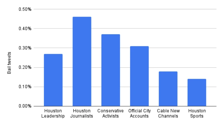
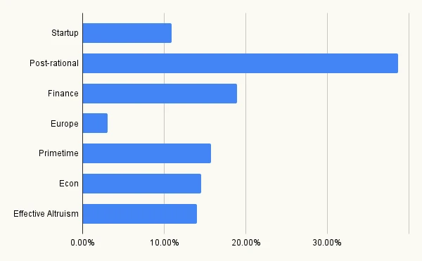
Below, you see the activity level of each community - the number of tweets per capita in the analysis window. It looks like the Effective Altruists are too busy to tweet.
 Community activity level (tweets / population)
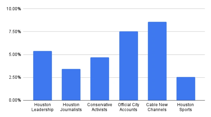
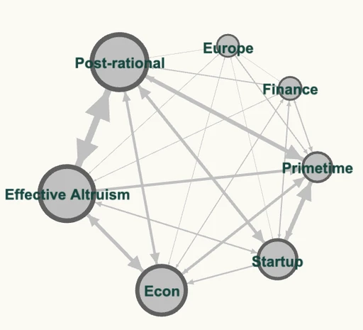
Now I’ll break down this activity to show connectivity between communities. This next chart shows the percent of each community’s tweets that don’t mention anyone outside the community.
You see how Post-rational is an especially self-contained community. I think this is reflected in the fact that this community is the most inscrutable to outsiders.
And Europe talks among themselves very little; they’re mostly on Twitter to engage with other communities.
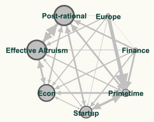
 Intra-community tweet volume
The charts below shows the volume of tweets sent between communities. The community’s size is its population. On the left, the width of the lines show the raw, non-normalized volume of tweets. On the right, the width shows the percent of each community’s tweets sent to each other community.
Once you’ve identified the communities, you can analyze accounts and tweets in the community. For accounts, I can show the most influential accounts, top phrases in user bios, and you can categorize accounts by industry and work role using keywords in their bio. For tweets, I can show tweets with the most engagement, top domains in tweets, and trends in keyword usage.
“Progress Studies” analysis methodology
To produce the above analysis, I used the data mining tool Minet to scrape tweets. I made a list of users who mentioned “progress studies” in Q1 of 2023, scraped all of their tweets, then scraped all tweets to/from accounts mentioned in those tweets. I scraped 5.2 million tweets in total.
Using the Python library Pandas, I transformed these tweets into a list of nodes (accounts) and edges (directed tweet mentions between accounts), with the edge weight being the number of mentions. I used Gephi to visualize and analyze the resulting network.
To determine the influence of each node, you could use PageRank or HITS algorithm, or the simple number of in-degrees. I’ve found HITS to be most suitable.
Then to group the nodes into communities, Gephi offers Modularity and Statistical Inference algorithms. Modularity lets you set a resolution (which influences the number of communities that are detected), so I prefer that one.
I wanted a clean visualization, so after finding each node’s influence and community I subset down to the 1,500 most influential accounts. I also thinned down the number of edges that were visible by subsetting to only those with large weights. Then I used the Force Atlas 2 layout algorithm to get the nodes to cluster according to their group.
Notes on Twitter network analysis
The most significant methodological decision when analyzing a Twitter network is the “discovery pattern” you use, which determines the aperture / magnification of your network.
The discovery pattern is how tweets enter your dataset. You can get tweets by searching for keywords, tweets from a given user, or tweets to (mentioning) a given user. You can get users by choosing them manually, extracting them from mentions in collected tweets, listing a user’s followers / following, or listing users who engaged with a tweet.
You layer these operations sequentially. In the “Progress Studies” analysis, the stack was: Users[keyword search “progress studies”] -> Users[Tweets from[Layer 0]] -> Tweets to/from[L1].
When scraping tweets based on a user, it makes a huge different whether you’re scraping 1) tweets from the user, 2) tweets mentioning the user, or 3) tweets from or mentioning the user. Option #3 returns way more than #1.
Your tweet-intake layer decisions, and the size of your Layer 0 user list, is the difference between an attractive, comprehensible network map and a massive, incomprehensible network haystack.
The Layer 0 “founder effect” matters less as the network grows larger. That’s because influential users exert such a gravitational force that, no matter where you start in the social graph, you will converge on the same graph as you pull in more broadly influential users.
Communities are fractal. The Dogecoin community is a community with the alt-coin community, within the crypto community, within the Tech community. You have to match your discovery pattern to the level of magnification you want to select for. There’s a bit of an art to this.
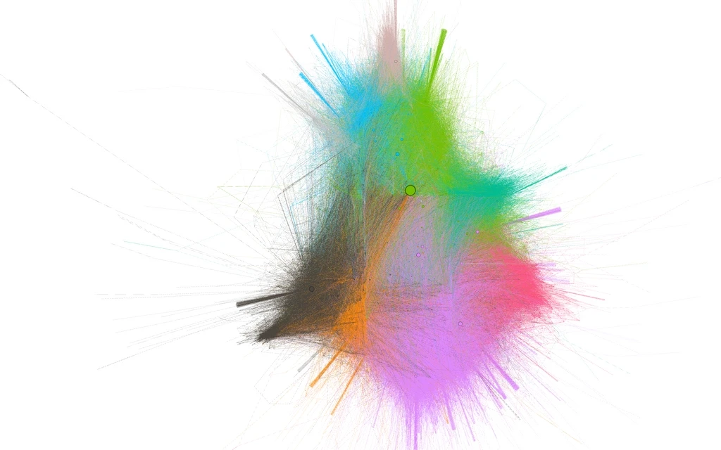
The “Tech Twitter” macro-network
This analysis, centered on “Tech Twitter”, collected ~38,000 accounts. This animation shows the full universe of accounts being whittled down as I filter for only those with higher and higher in-degrees weights, the number of tweets mentioning them. The last frame shows accounts with 15 tweets mentioning them.
This is a good example of how a wide discovery pattern overwhelms founder effects. Layer 0 was tweets to or from @ContraryCapital, and Layer 1 was tweets to or from accounts discovered in Layer 0 - that’s it. And yet the result is about the same as you’d get if you started from any VC-oriented account (with one exception that I’ll explain soon).
We can use any continuous numerical variable to set the size of each node (the largest nodes are labeled, with labels proportionate to node size), which I use to represent the node’s influence. The simplest measure of influence is in-degree, the number of other nodes linking to the node:
I like the simplicity and explainability of the in-degrees variable. But ranking algorithms improve on in-degrees by recursively considering the importance of the node that is linking. Here’s HITS:
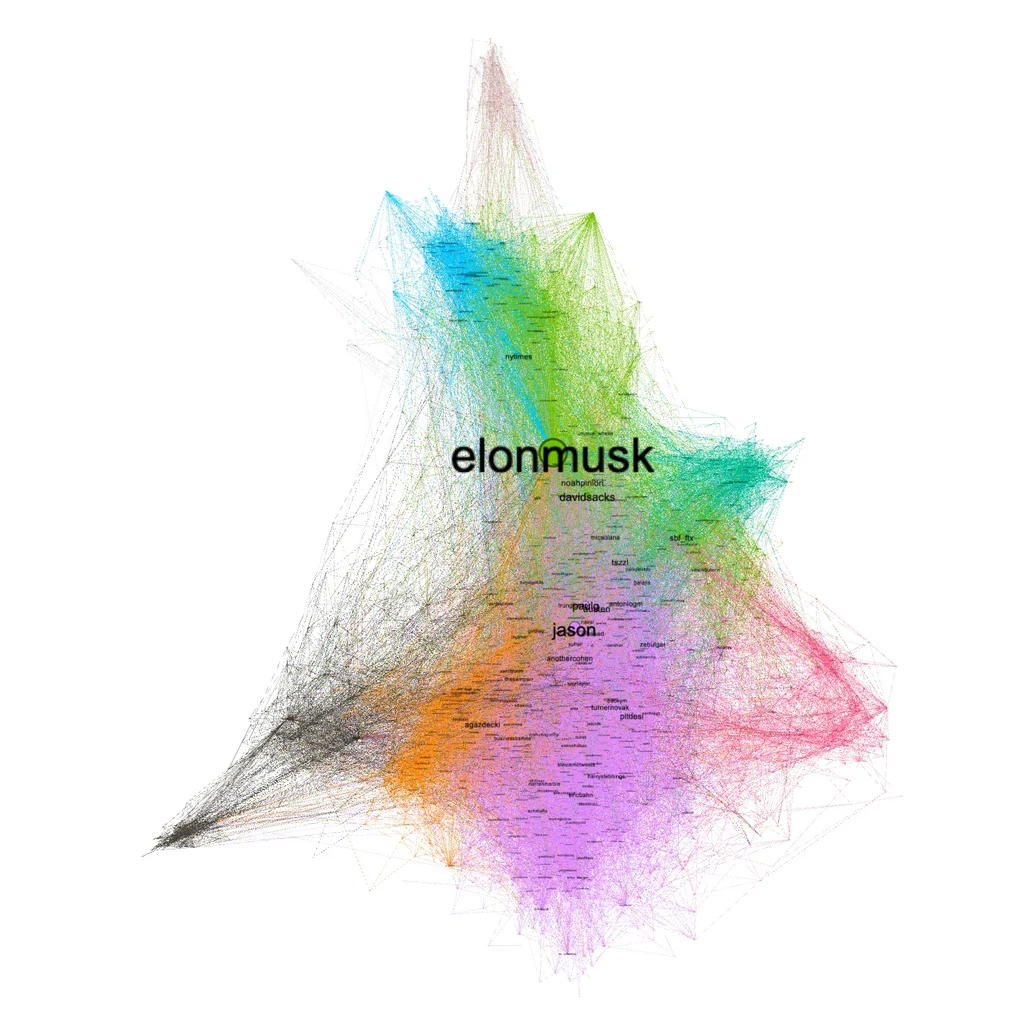
In this next visualization, I use the PageRank algorithm to set node sizes. Notice how Eric Tarczynski and others affiliated with Contrary Capital show up in this visualization where they didn’t before.
I think this is because 1) PageRank is the “simpler” algorithm and assigns mistakenly high scores to “closed loop” circles of people mentioning each other; and 2) the Contrary mafia is the only clique that showed up in the dataset because only people who mentioned or were mentioned by @ContraryCapital had all their in/out mentions scraped. If I’d included an additional layer, I don’t think this would have happened, but I’ve decided that HITS is the better algorithm anyway
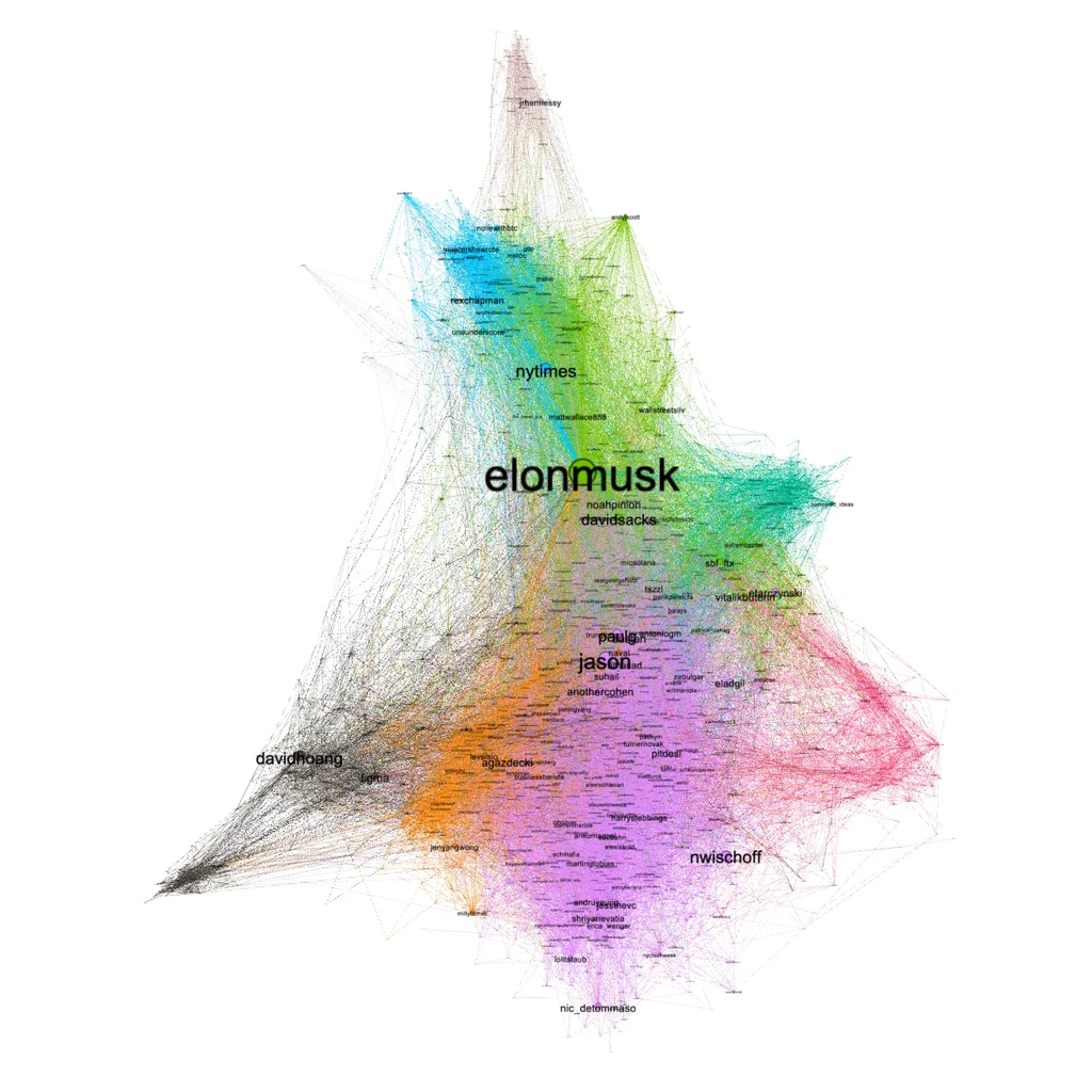
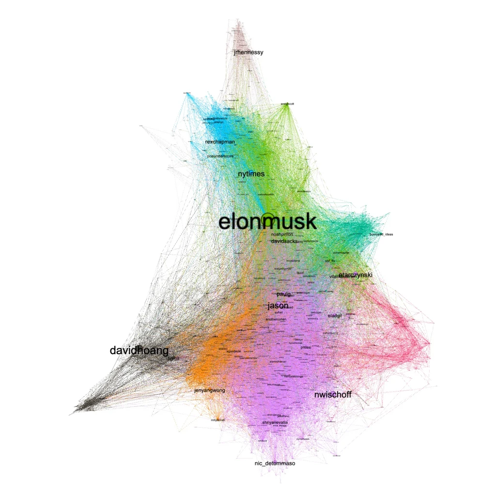
This next animation shows each colored sphere within the network (unfortunately, nodes are sized by PageRank):
When you compare the groups by the accounts they contain, it’s pretty clear how they differ.
For the black group on the bottom left corner, the most common words in their bios are “design”, “designer”, and “product”. Their most common hashtag is #blacklivesmatter, and the most common @mentions are @webflow, @mastodon, and @figma.
In the orange group on the bottom, the top two-word phrase in their bios is “product manager”, and their top hashtags are #nocode, #startups, and #productmanagement.
The purple group’s top accounts are Jason Calacanis, Paul Graham, and Austen Allred. The most common words in their bios are “founder”, “building”, and “co-founder”, and the most common two-word phrases are “early stage”, “venture capital”, and “angle investor”. The most common @mentions in bios are @beondeck, @ycominator, @google, @stanford, and @a16z.
The green sphere in the center with Elon Musk in it is, as usual, a bunch of very large Musk-affiliated accounts like David Sacks, @unusual_whales, and @jack.
There’s another group right in the middle of the triangle that is hard to see in the visualization. This group has heavy overlap with the “post-rationalist” and other spheres from the above “Progress Studies” analysis. I wish they showed up more clearly in the visualization because it’s a great example of how communities are fractal. Top accounts are @noahpinion, @tszzl, and @eigenrobot.
The green sphere jutting out on the right are non-tech investors. The most common words in their bios are “investment”, “investor”, and “investing”, and the most common two-word phrases are “investment advice”, “real estate”, and “long term”. Top accounts in this sphere include @patrick_oshag and @moseskagan.
The red corner on the right are crypto people. The top hashtags in their bios are #web3, #refi, #bitcoin, and #nft.
The blue group is mainstream U.S. news/politics discussion. Top accounts are the New York Times, the GOP, CNN, and MSNBC. The most common location in their bios is Washington, DC. Their most common in-bio phrases are “official twitter” and “white house”. Their top hashtags are #blm and #resist.
The grey group above the blue contains UK accounts. Top accounts there are @samfr, The Telegraph, and @dannybster. Again, geographic divisions often show up in Twitter social networks. (There’s another sphere I excluded from the visualization for being too small which is best described as “Australia Twitter”).
The “Houston Twitter” analysis
This analysis was different for being geographically focused. This is a helpful constraint because it allows us to collect a large number of accounts (I crawled ~500,000 accounts for this analysis) without having the network become dominated by Musk et al. because we filter out non-Houston accounts.
Filtering out non-Houston accounts wasn’t very challenging. I looked for the presence of certain keywords (eg. ‘Houston’, ‘HTX’, ‘Astros’) in user bios. Of course this gives plenty of false negatives, but I still ended up with 16,000 accounts, which is enough for meaningful analysis.
Here are the most followed Houston accounts:
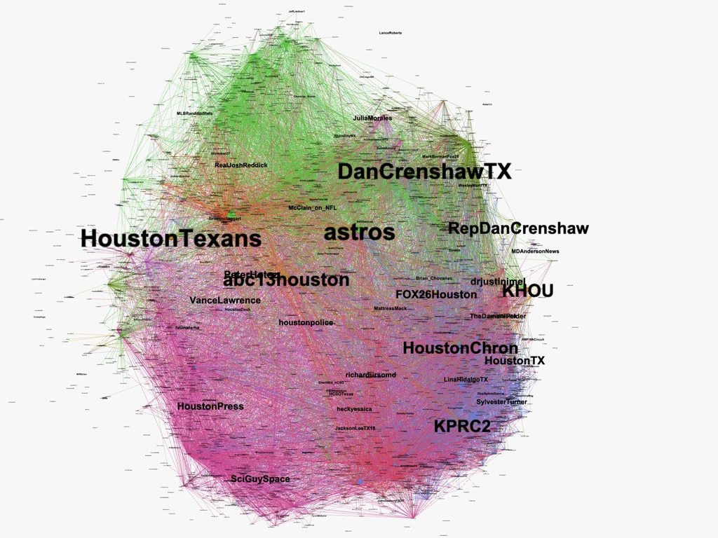
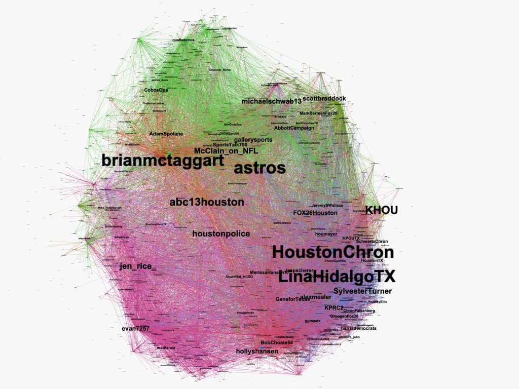
And the most influential (using HITS) Houston accounts:
And finally, here is how I characterize each sphere. Again, the distinctions between the spheres come through very clearly in analysis.
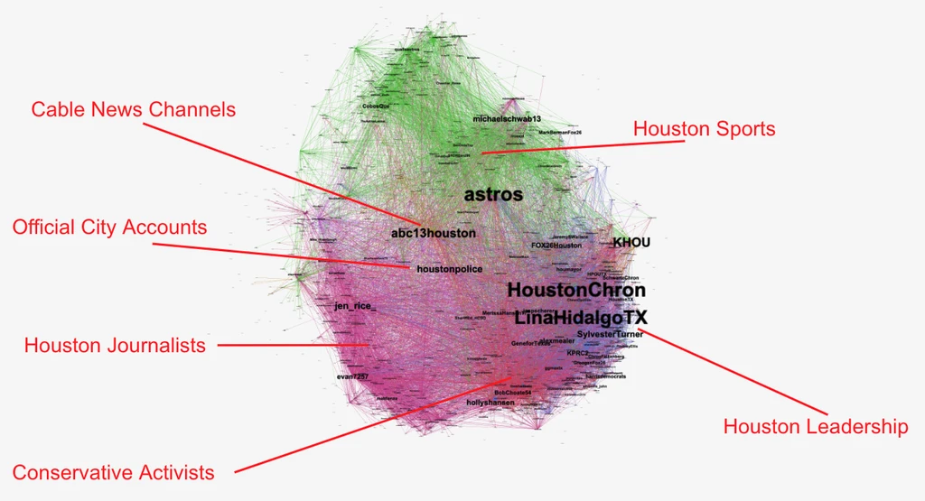
I won’t go through each sphere in detail, but I’ll give a brief taste of the kinds of useful information we can draw from this kind of “spheres analysis”.