Hard-Signal News Experiments
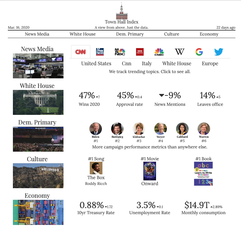
Town Hall Index
I created Town Hall Index, an aggregator of hard-signal indicators on the political and economic situation.
This was an experiment in whether a consistent panel of signals could be a compelling complement to narrative-based news content selected by editorial judgment.
 Town Hall Index.com landing page from March 2020, from Archive.org.
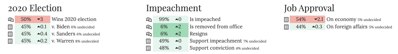
Town Hall Index was popular during the 2020 Democratic primary election for tracking more election-related metrics than any other site.
For each candidate, I tracked their polling, mentions on cable news (thanks to GDELT), betting odds on the prediction market PredictIt, cash on hand, Twitter followers, and Google search interest rank.
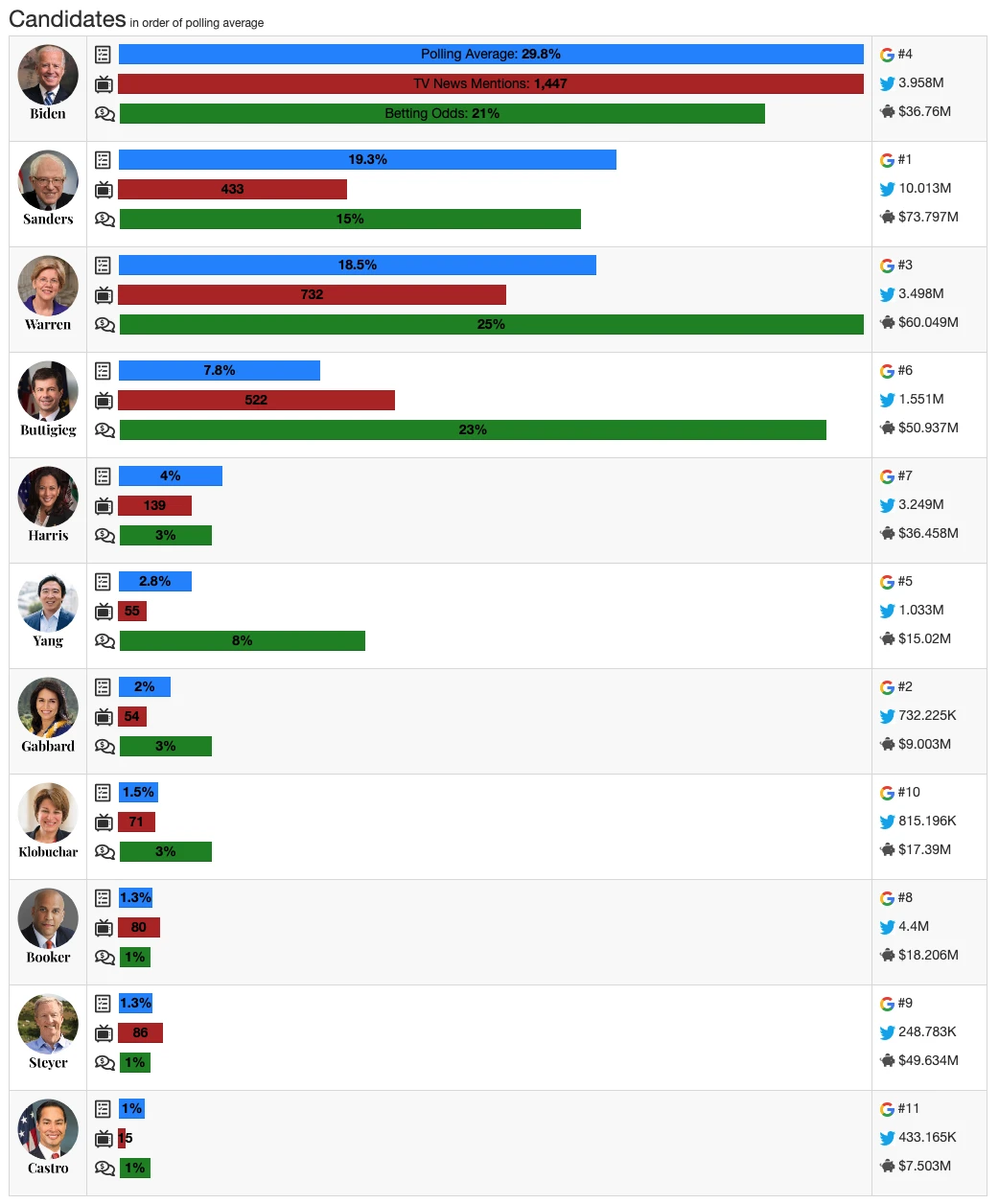
The Twitter account had 9 million monthly impressions, and was followed by some of that cycle’s senior campaign officials. One graphic I posted, showing the ratio of each candidate’s polling to media coverage on each TV network was cited by Andrew Yang’s campaign when they decided to boycott MSNBC.
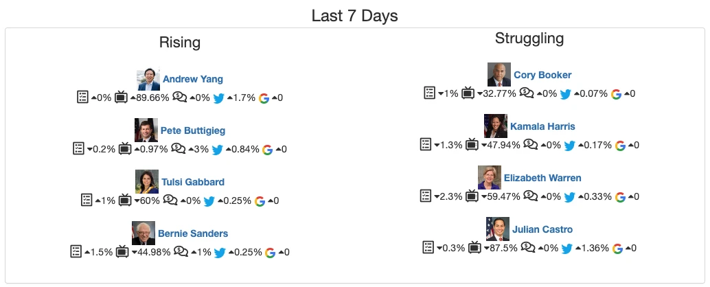
 Other polling averages and betting odds.
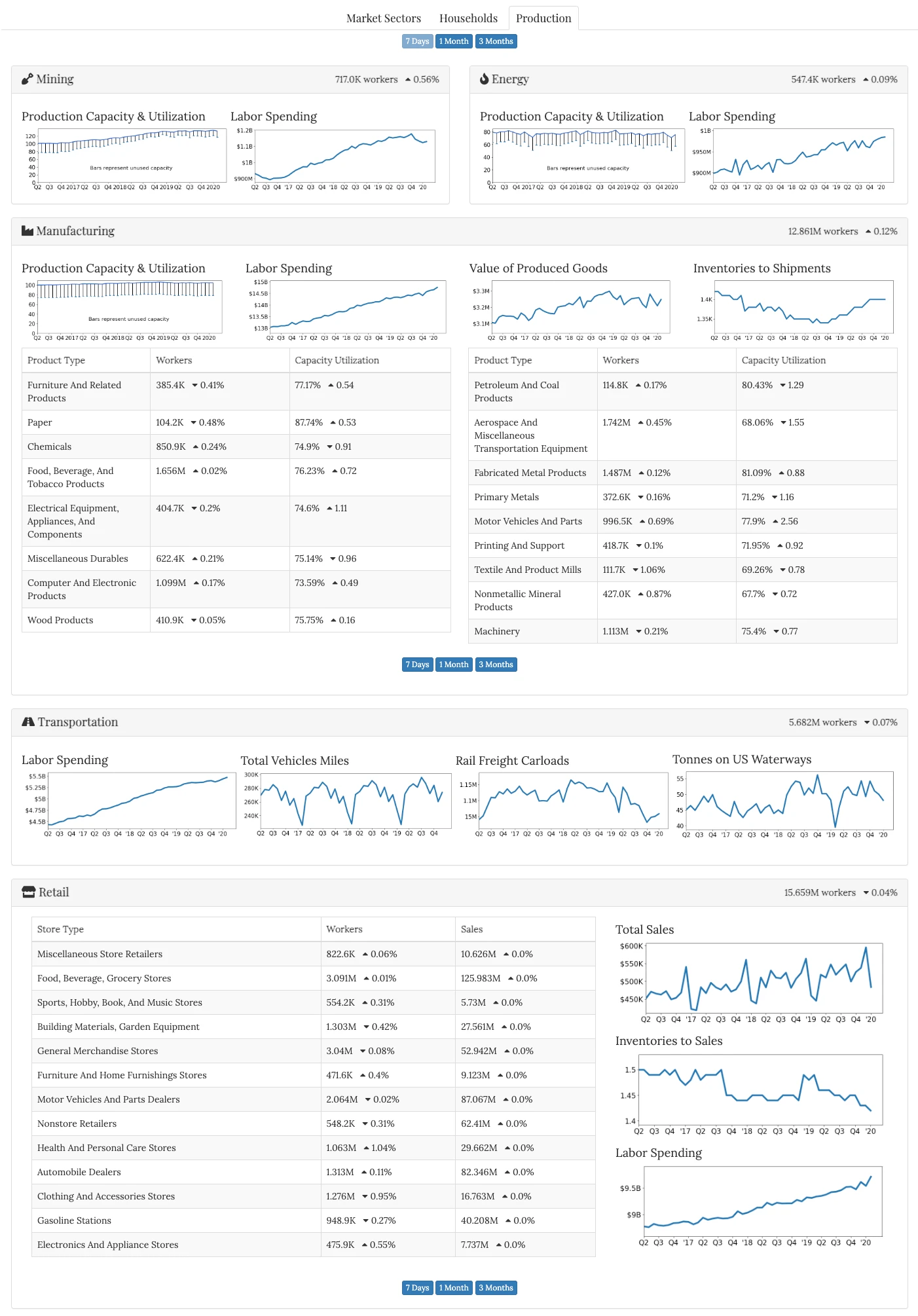
I especially liked my economic dashboards. They represent a lot of time spent going through economic data releases and thinking about how they fit together, how they should be organized, and what the fundamental metrics are.
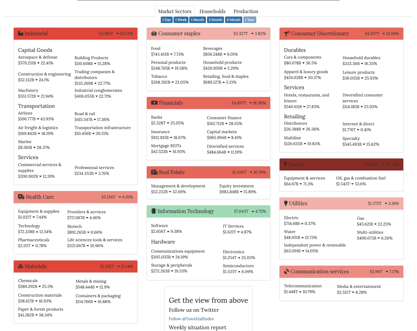 Market heat map of S&P sectors and sub-sectors, rather than individual companies.
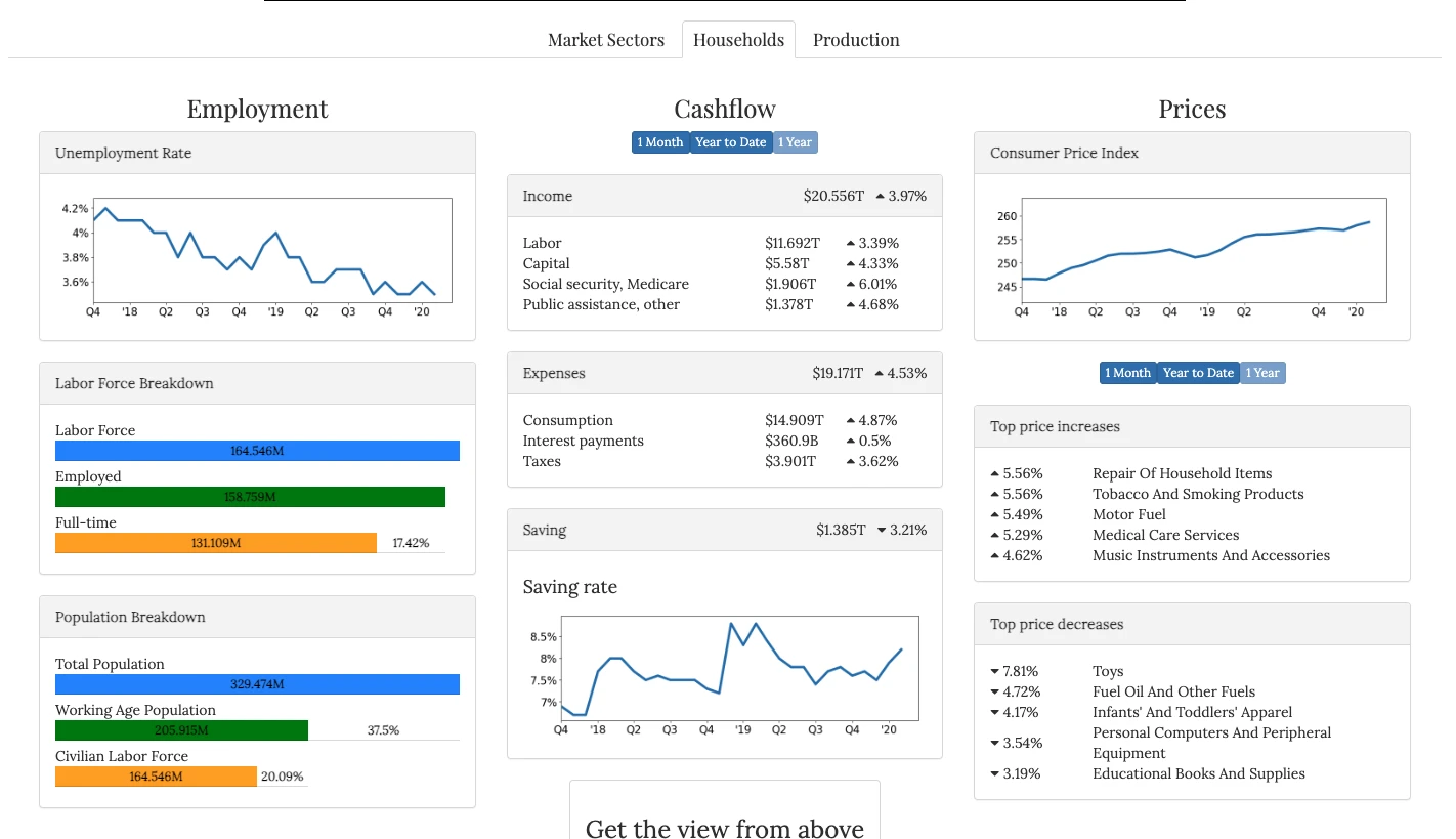
Timeline Infographics
As part of Town Hall Index, I produced a few timeline infographics combining time series metrics with discrete events to show how narratives and events developed. I was thrilled with how they were received.
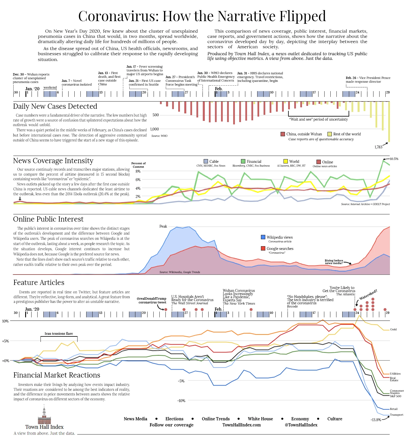 Timeline of the market crash as awareness spreads of the novel coronavirus.
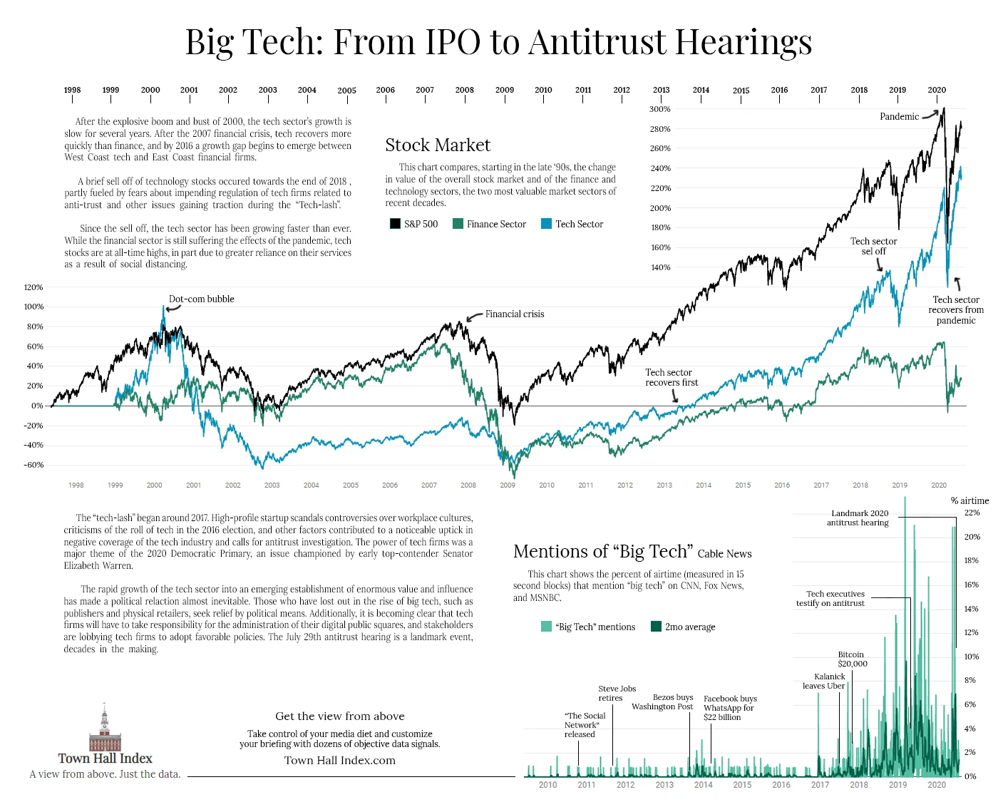 Timeline of tech and finance industry stocks, compared with "big tech" coverage.
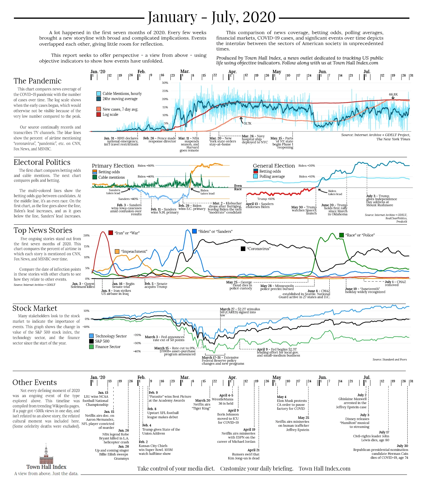 Timeline of most of the important events of the first half of 2020.
Clear Brief.news
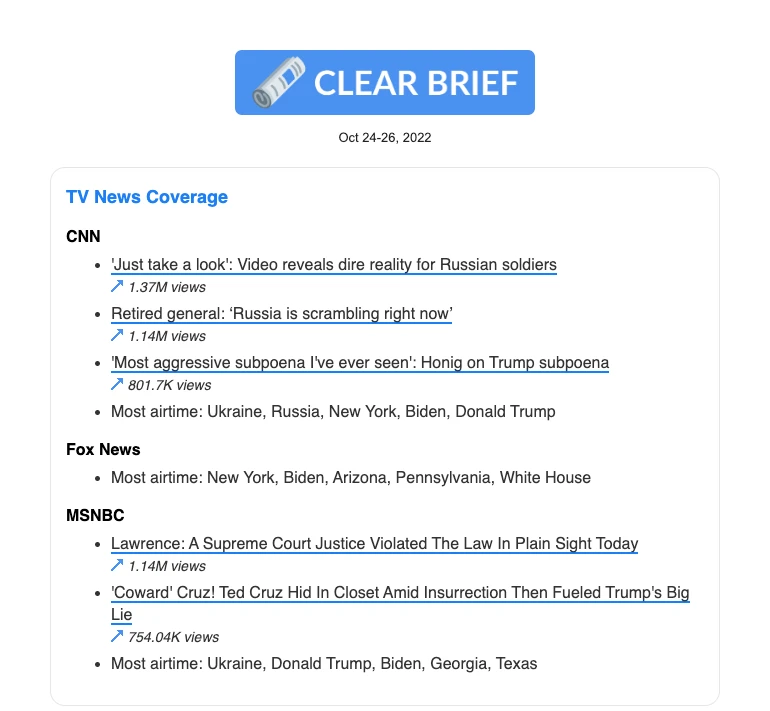
A later project was ClearBrief.news, an aggregator of U.S. media trends. To see what stories have the attention of the American public, I brought together the most viewed content across TV, print, and various places online.
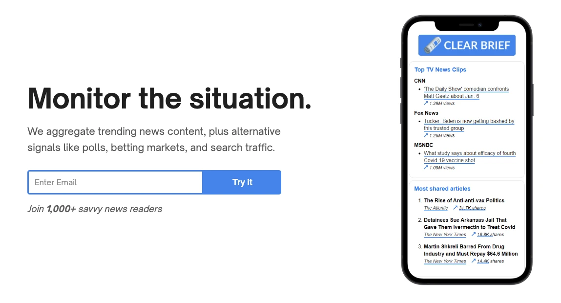 ClearBrief.news landing page from May 2022, from Archive.org.
The TV News Coverage section summarizes what’s on cable news. I scraped videos posted to the CNN, Fox News, and MSNBC YouTube pages, and I showed the top 5 most viewed. And I listed the keywords with the most airtime on each, which I got from GDELT.
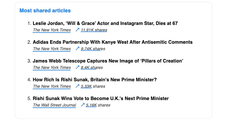
The Most Shared Articles section shows the articles from print newspapers and magazines that had the most shares on social media.
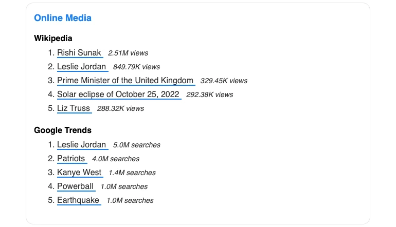
The Online Media section shows organic interest through the most viewed Wikipedia articles and the most searched terms on Google.
The types of items you see most commonly here are related to sports, movies, celebrities, and major news stories. It’s interesting to see which stories see lingering Wikipedia interest.
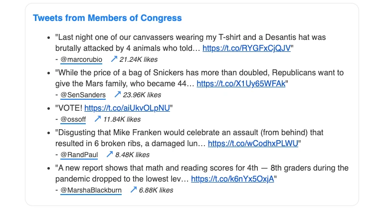
The Tweets from Members of Congress section shows tweets from members of Congress that got the most likes. This reflects the member’s national profile and the topics that are resonating with the public. Senators want to be hot on Twitter.
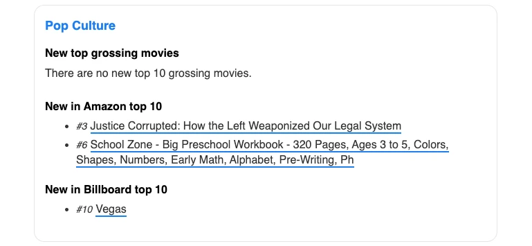
The Popular Culture section shows new top grossing movies, best selling books on Amazon, and in the top 10 on the Billboard 100.