k-Clustering American Community Survey Respondents
I grouped respondents to the American Community Survey, based on their answers, using k-means, into seven socioeconomic groups that cut across headline characteristics like race, age, income, etc.
These groups can be used as crosstabs to break down survey responses by categories that cut reality closer to the joints, revealing which headline variables most determine these natural groupings.
Dumb Crosstabs
I love survey data. I even collect issues of the Statistical Abstract of the United States.
 My collection of publications of The Statistical Abstract of the United States.
But my heart longs for smarter crosstab groups. When I read data tables like the ones below, I find myself trying to tease out some hidden vector that cuts through the crosstab variables with greater predictive power.
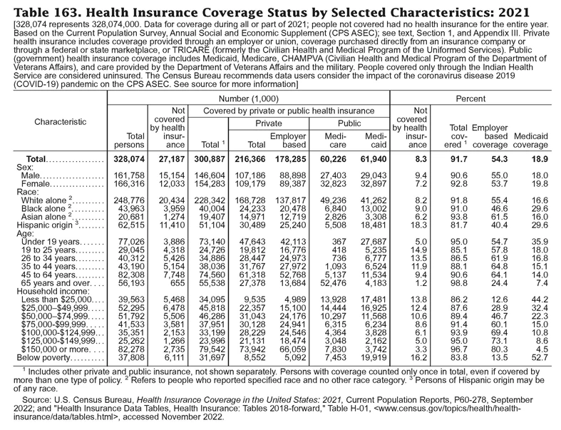 From The Statistical Abstract of the United States 2022.
For example, health insurance enrollment is not driven by race or income, it’s driven by more concrete factors (eg. employment status) that correlate with those headline characteristics.
I became possessed by the idea to find natural, multivariate socioeconomic groupings within the U.S. population.
The Data
To do this, I would need a dataset with comprehensive socioeconomic details for a large and representative sample of the U.S. population, with the highest possible methodological rigor. As an avid consumer of government statistical services, I knew just where to go.
The American Community Survey, conducted by the Commerce Department’s Census Bureau, is the largest annual demographic survey in the U.S. The ACS surveys 3.5 million people every year, asking over 100 questions ranging from the standard socioeconomic to details about ancestry, components of income, and lifestyle.
And it’s free of most of the sources of error that plague other surveys (eg. response bias) because responses are required by law and frankly they just work harder and spend more money to get quality responses. It really is the gold standard.
And critically, the ACS makes available anonymized “microdata”. This is data where the columns are survey questions, the rows are respondents, and the cells are the respondent’s answer to the question. I downloaded the microdata from here. (If you want to replicate this project, it’s important to read this guide and this guide).
Data Preparation
Here are the major data preparation steps I took:
- Replaced NaNs.
- Replaced the column name codes and value codes with the readable version. Refer to the the Data Dictionary. You’ll want the data dictionary as a CSV, here. (This was annoying and took a while; if you’re trying to do this, email me and I can save you some time).
- Added geographic information. For each respondent, the dataset gives their Census region, state, and a “Public Use Microdata Area” (PUMA) code. The PUMA code the ~10x larger than a Census tract. There’s too big a big jump between PUMA and state - neither is very useful. Instead, I identified whether the respondent’s PUMA is in a rural or urban area. I should have tried mapping PUMAs to counties or zip codes (too late now, I’m so done with this project), but I’m not optimistic. It’s a shame because I feel that location tells a lot about a person, but I’m not sure what actual variable carries that predictive power. I leave this problem to future generations.
- I turned numerical variables like age, weight, and total income into categorical variables. For each, I created five equally sized buckets, and I placed each respondent into one of those buckets. For public assistance income, self-employment income, and interest/dividend/rental income, I turned those into binary variables of whether or not the respondent reported any income of that kind.
- I one-hot encoded the categorical variables.
Next, I subset the data to only include respondents that were:
- Texas residents. I felt that the U.S. is too large and diverse to cluster at the national level. I chose Texas because I’m from Texas. The survey had responses from 261,446 Texans - 0.89% of the population.
- Aged 24-64. I decided to focus on the working age population because life stage is a powerful variable that I didn’t want to deal with.
- Male. Again, to limit the scope of the project.
For this dataset of working-age men in Texas, I selected 28 survey variables that I thought would have the most predictive power. I’ll run through each of those variables in detail soon.
k-Means Clustering
The way to cut through all those variables to find socioeconomic clusters is to map each respondent in “feature space” (a high-dimensional coordinate plane where each dimension is a question on the survey) and use a clustering algorithm to group them such that people within a group are similar to each other (based on their survey answers) and people in different groups are dissimilar.
I decided to use the k-means clustering algorithm. Honestly I think that agglomerative clustering would have been more interesting because it would have allowed us to look at clusters at multiple levels of magnification. But k-means produces a classifier model (agglomerative doesn’t). That classifier model is what we’ll use to add smart socioeconomic groups to future survey data for smart crosstabing.
The standard way to decide how many clusters for k-means to make is to graph the within-cluster sum of squares (WCSS) for a range of k, then choose the k where the graph begins to show diminishing returns. I did that and chose 7.
I imported sklearn.cluster.KMeans with all my might, and through deep focus and concentration I managed to run the following code:
from sklearn.cluster import KMeans
kmeans = KMeans(n_clusters=7, random_state=0)
encoded_df['cluster'] = kmeans.fit_predict(encoded_df)
The Resulting Clusters
We now have seven clusters, and at this point, I have to do some naming.
First, I’m going to call these “clusters” or “groups”. This lets me sidestep the question of whether these things are “classes”, “socioeconomic groups”, or something else. Your guess is as valid as mine, so I’ll let you decide for yourself.
Second, I have to decide what to name each of these groups. It’s tricky to condense a group down to two or three words, and whatever name I choose will have a large impact on how you perceive the group. I worry that naming them will reduce them to crude characters. But there are seven of them; that’s too many to just use numbers. I have to name them.
And I have to admit… I didn’t name them very well (with the exception of “Able Idle”, of which I am very proud). I originally named them after a cursory data dive, but after looking at every variable in detail I realize that the names are not great. But I’ve already saved a bunch of Excel charts and I’m not going to redo it, so we’re just going to have to live with it.
And finally, before we dive into the data, I want to stress that these are highly diverse groups. There are ~7 variables that powerfully determine the contours of these groups, and while some groups have stark differences in 2-3 variables, there is no group that is not diverse in 4-5 variables. Be prepared to hold a lot in your head, or else
With that said, our groups are:
- Professionals 1
- Professionals 2
- Native working class
- Immigrant working class
- Other working class
- Able idle
- Less-abled
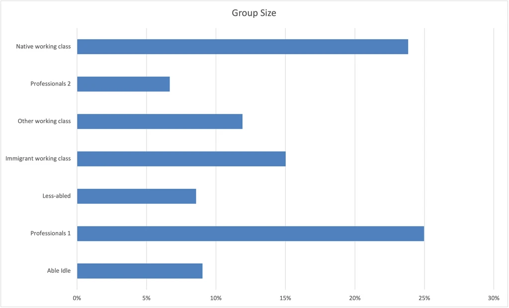
Here are our groups, shown as a percent of the total dataset:
Now, I’ll go through each variable that was included in the analysis and break each group down by their response to the variable.
Variables in the Analysis
I’m going to list every variable that was included in the analysis. Charts with horizontal lines show the percent breakdown of responses to the question, within each group. Charts with vertical lines show the percent breakdown of groups, for each question response.
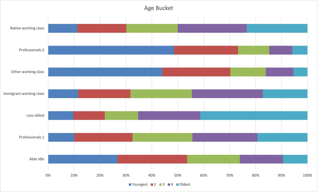
Age
Even though I focused this analysis on the working age population, I wanted to include age buckets in the analysis because age matters within the working age years. See Data Preparation for how I turned numerical ages into buckets.
- Less-abled are older.
- Professionals 2 and Other working class are younger.
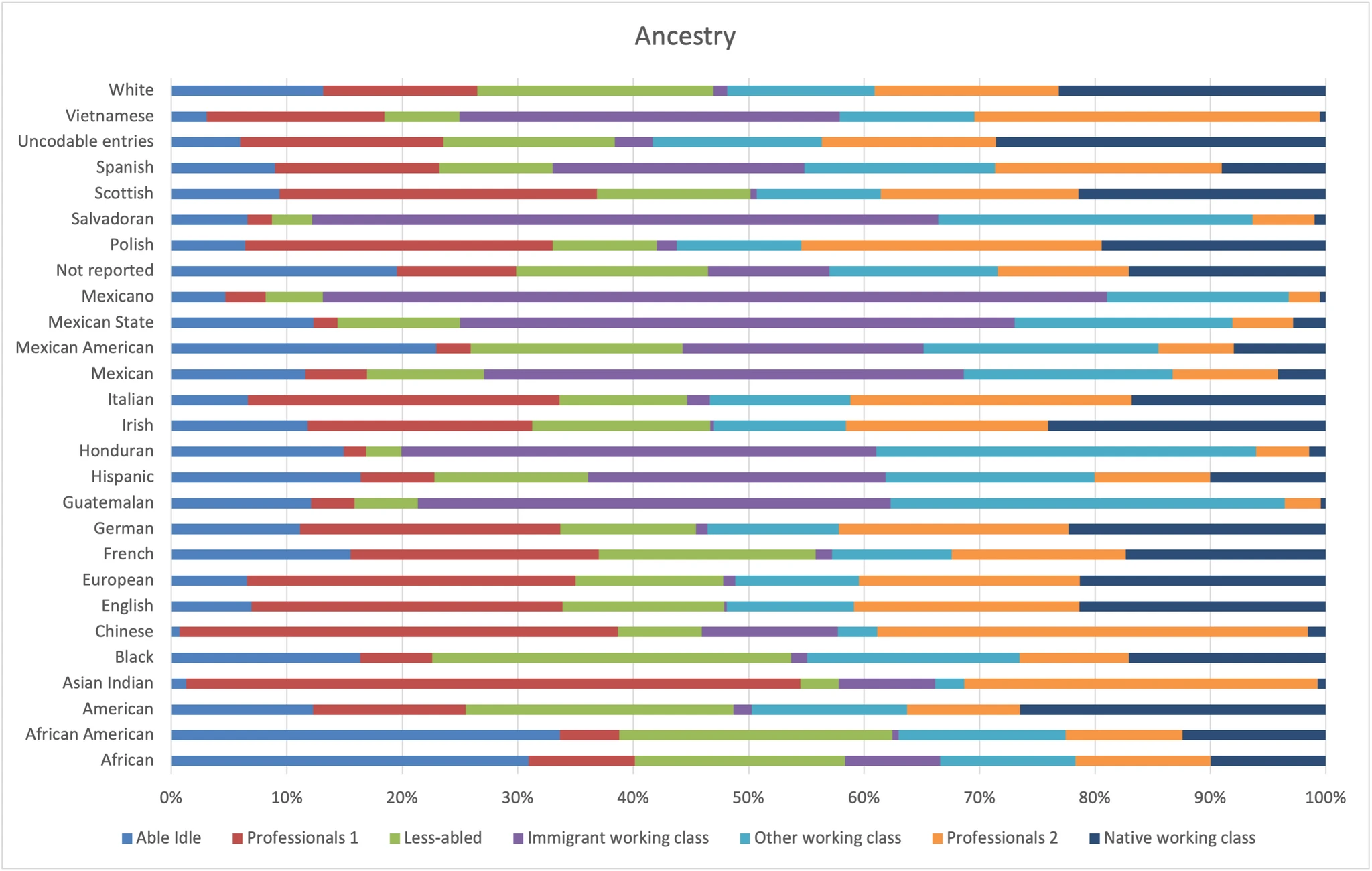
Ancestry
This is a pretty cluttered one. Notice that there are answers that could be combined (eg. “Mexican” and “Mexicano”). We’ll see a cleaner race variable later, but this includes details that the other cleaner one does not.
- Immigrant working class is heavily Latin American, especially Mexican and Salvadorian.
- Professionals 1 has more Whites and Indians, and Professionals 2 has more Vietnamese.
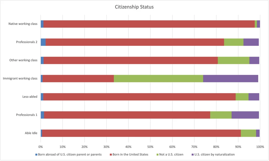
Citizenship Status
The Immigrant working class stands out prominently here, but notice that it is still >30% born in the U.S. This goes to show that these categories are squishy.
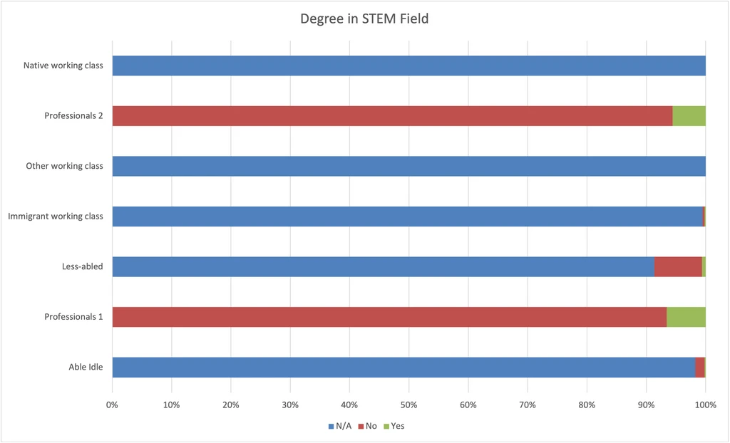
Degree in STEM
This chart shows very clearly that having a bachelor’s degree is one variable that sharply divides our groups.
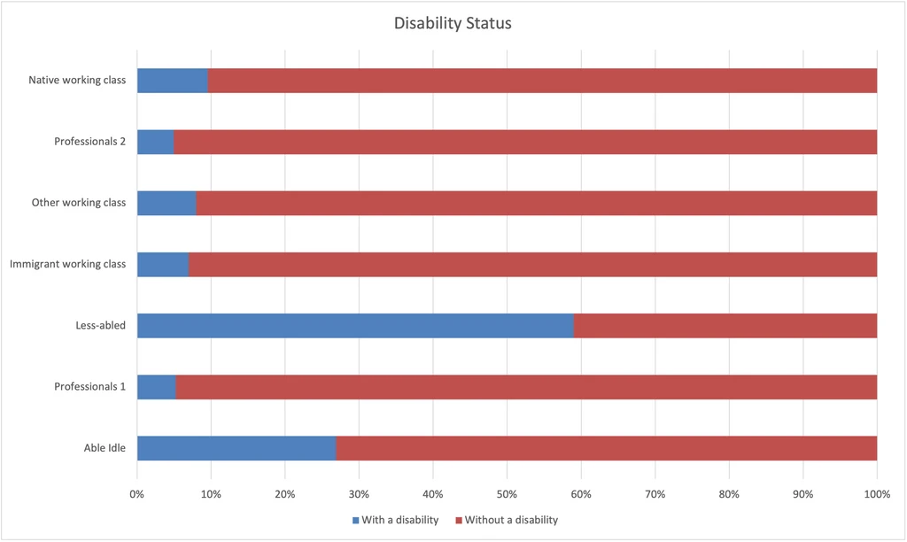
Disability Status
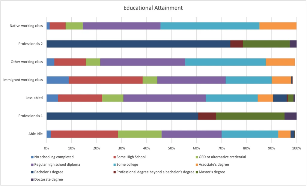
Educational Attainment
Again, edutainment divides our groups starkly.
- Professionals 1 are slightly ahead of Professionals 2, with a higher rate of secondary degrees.
- The Native working class have the most education of the working classes.
- The Able idle have the least education overall.
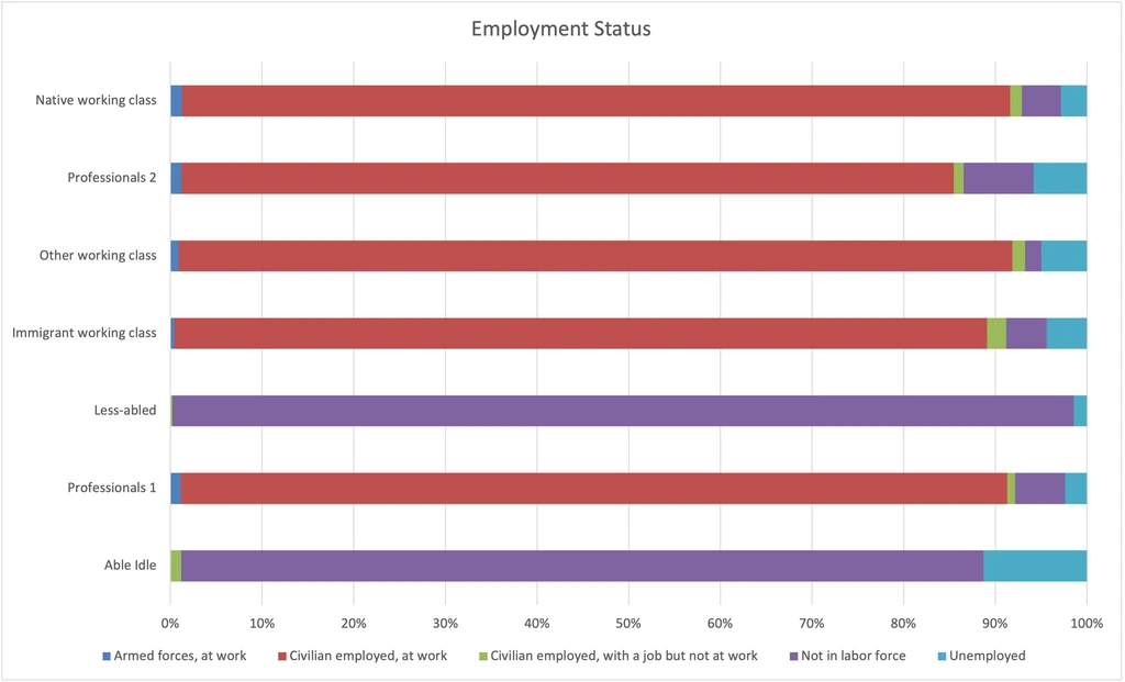
Employment Status
This variable divides our groups as strongly as education.
- Less-abled and Able idle are almost all unemployed or not in the labor force.
- After them, Professionals 2 have the highest unemployment rate, probably reflecting a greater savings cushion to see through periods of unemployment.
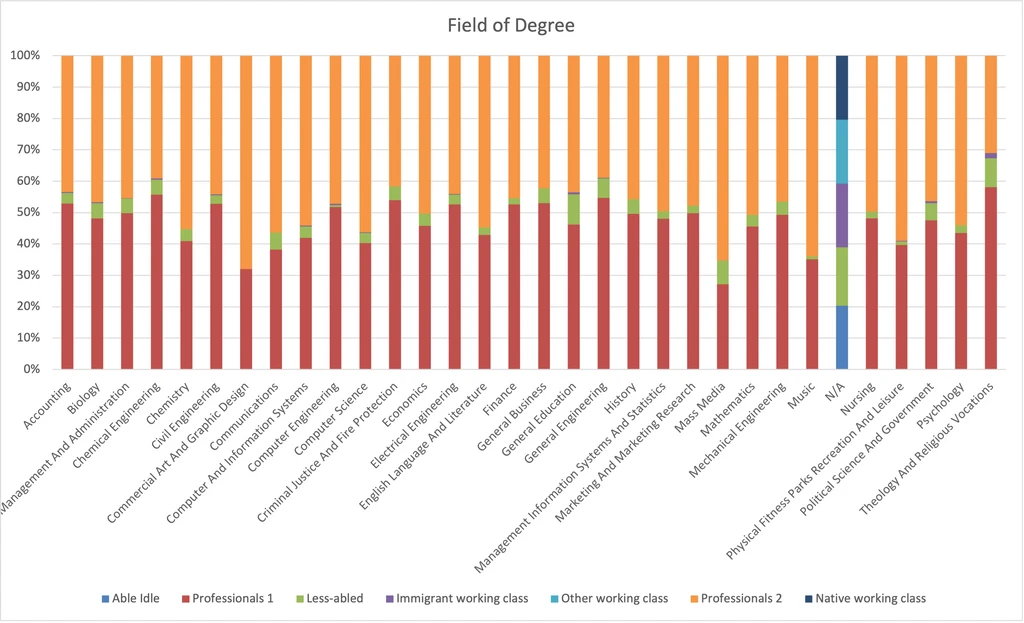
Field of Degree
- Degrees in Mass Media, Commercial Art and Graphic Design, and Music, are more common among Professionals 2 than Professionals 1.
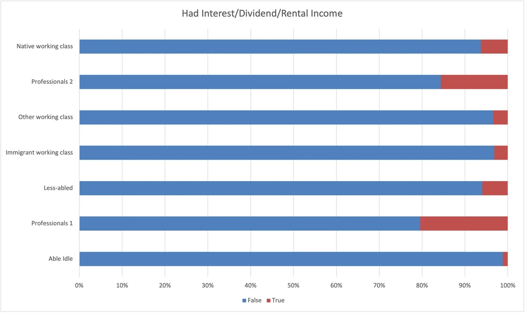
Had Interest/Dividend/Rental Income
I’ve written before that I believe that one’s occupation and sources of income are powerfully determinative of one’s economic class, and I wanted to test that hunch. This chart shows the percent of each group that reported >$0 in capital gains.
- Professionals 1 nose ahead of Professionals 2 in this category.
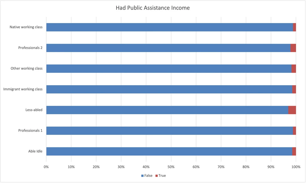
Had Public Assistance Income
- Very few of any group reported public assistance income.
- Able idle reported public assistance income less often than Professionals 2.
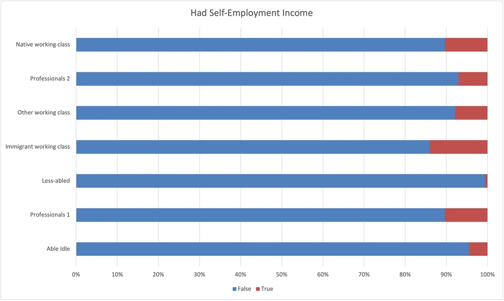
Had Self-Employment Income
- Immigrant working class has the most self-employment income.
- Professionals 1 have about as much self-employment income as Native working class, more than Professionals 2.
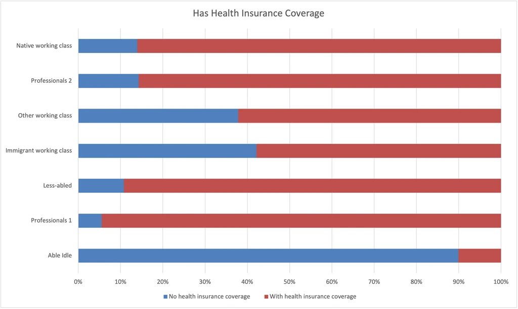
Has Health Insurance Note that Texas has the highest uninsured rate in the U.S. (18% in 2018).
- Coverage rate is brought up by Professionals 1, Professionals 2, and Native working class.
- Coverage rate is brought down by Immigrant working class, Other working class, and Able idle.
- Able idle are shockingly under-insured.
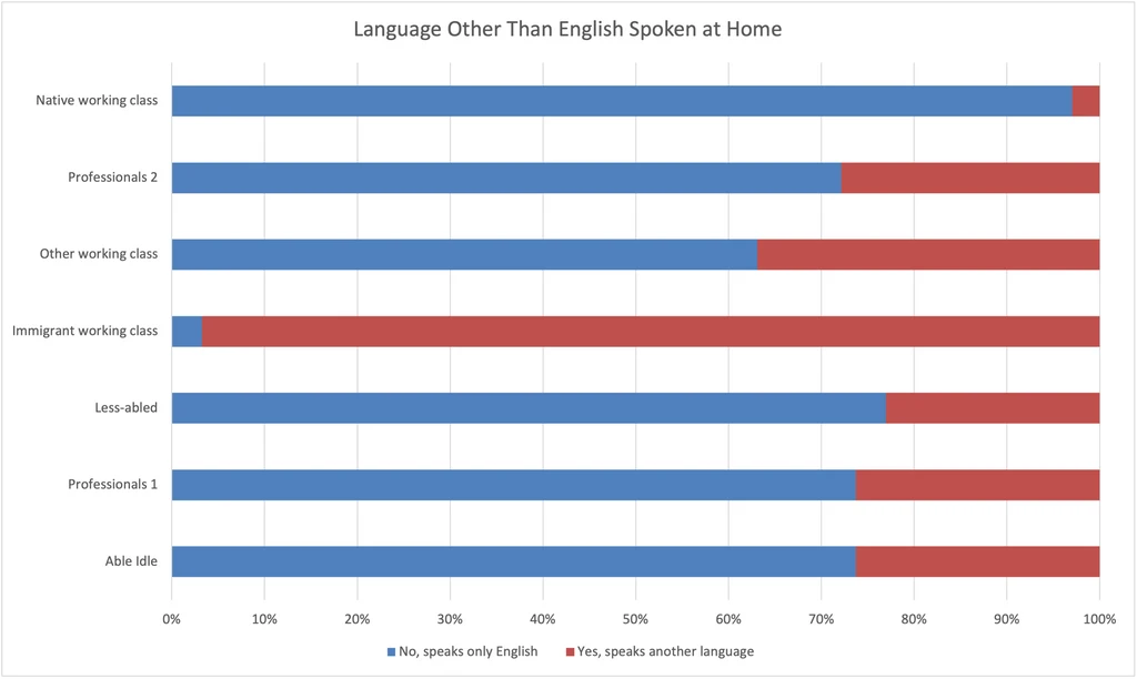
Language Other Than English Spoken at Home
- This variable is more distinct to Immigrant working class than Citizenship Status.
- Native working class has minuscule rate of speaking a second language at home.
- Other groups average ~25% rate of speaking a second language at home.
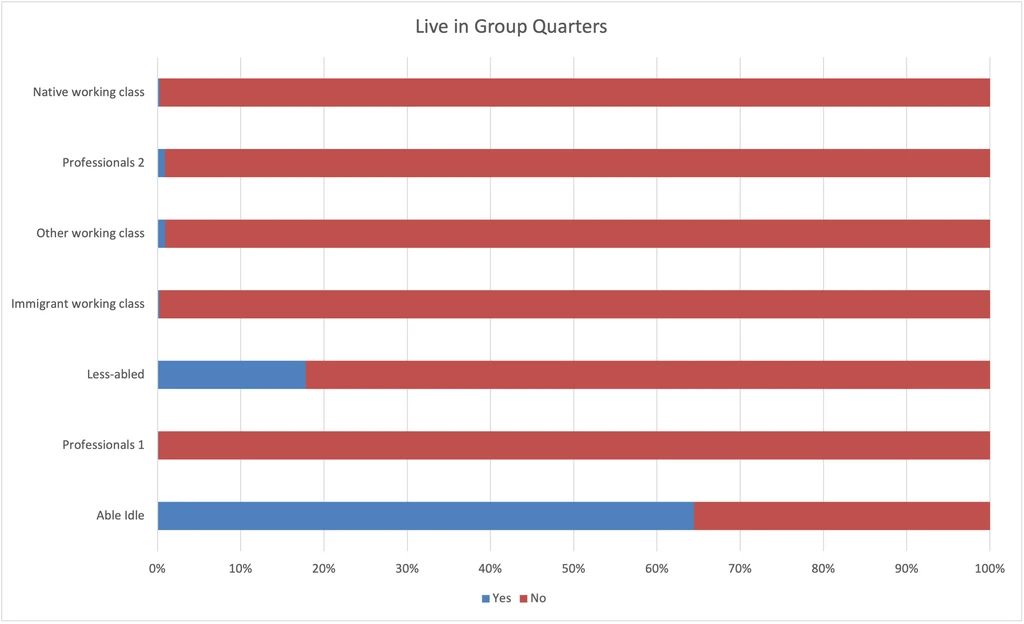
Lives in Group Quarters Group quarters is an institutionalized living situation, like a nursing home, college dormitory, or prison. The Able idle aren’t in nursing homes or dorms, so they must be in prison. I’m not sure if this is the case, but it does square with other data.
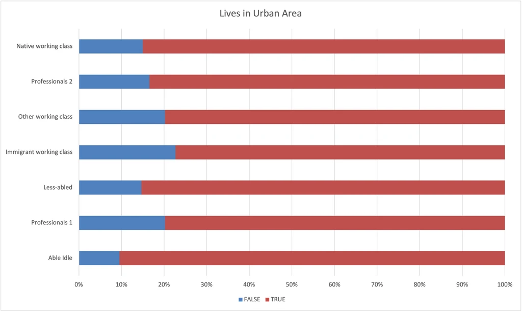
Lives in Urban Area
I was surprised that there wasn’t a clearer rural / urban divide. I still believe that location can predict a lot of things about a person, but I think in this analysis I didn’t have geographic features at the right level of granularity.
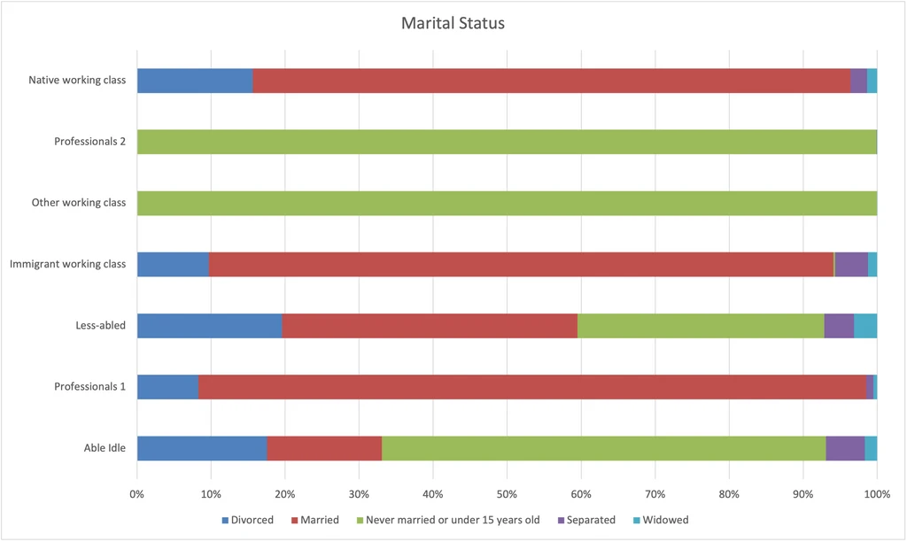
Marital Status
I think that this variable reflects a respondents age, stage of life (people tend to not marry until they’ve completed their education and have begun their careers), and community well-being. -Where previously Professionals 1 did slightly better on most metrics, here there is finally a variable with a clear divide between Professionals 1 and Professionals 2. -I think the martial status differences between Able idle and Less-abled reflects differences in well-being. -I think the differences in age reflect the differences between Professionals 2 (younger) and Professionals 1 and between Other working class (younger) and the other two working class groups.
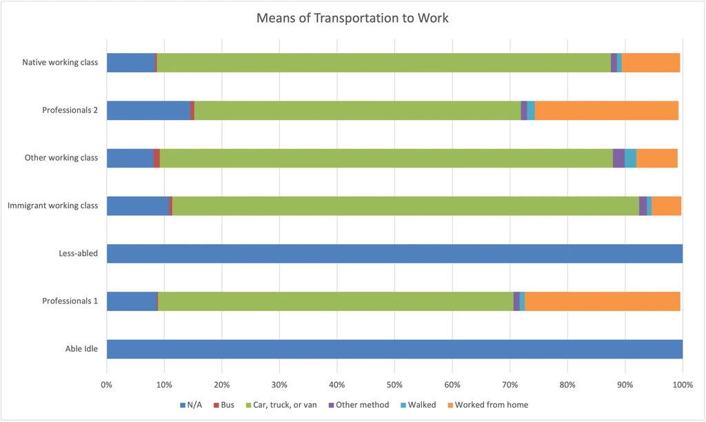
Means of Transportation to Work
- Professionals are more likely to work from home.
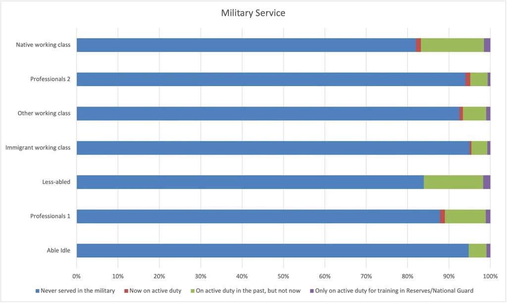
Military Service
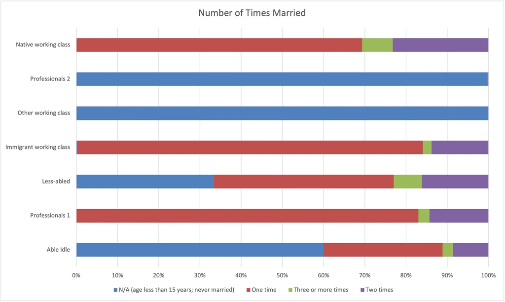
Number of Times Married
If marital rates show well-being, the number of times married provides added texture.
- Although the Native working class and Immigrant working class have similar, high marriage rates, the Native working class has more divorce. That probably reflects the religiosity of those populations.
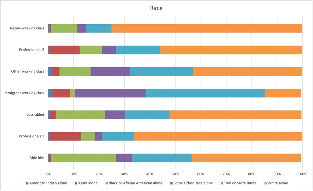
Race
Note here that “Some Other Race” and “Two or More Races” refer to different races for different groups. Refer to the Ancestry chart to dig in more.
- American Indians have mostly been grouped with the Immigrant working class, which couldn’t be further from the truth!
- Blacks are over-represented among the Less-abled and Able idle.
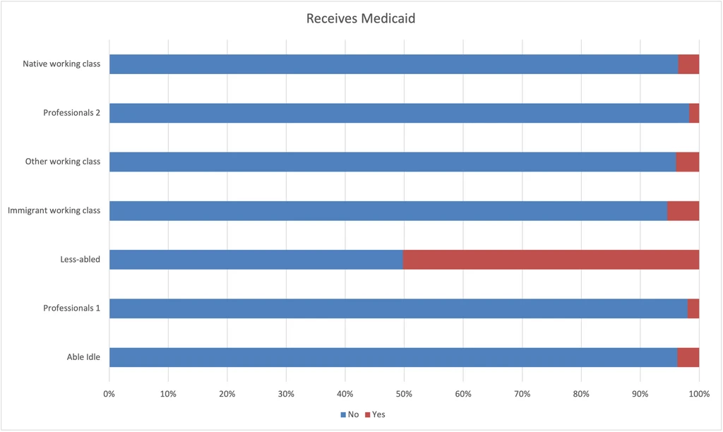
Receives Medicaid
This chart helps us penetrate the insurance coverage and social assistance of each group.
- Unsurprisingly, the least-abled group receives the most Medicaid.
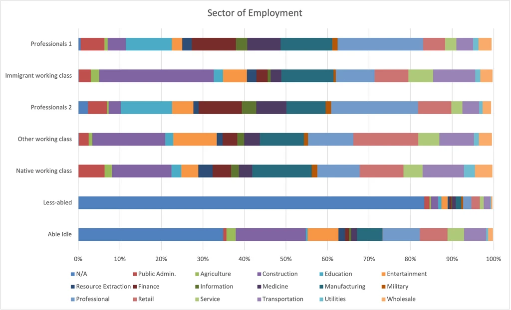
Sector of Employment
I was very excited to see the results for this chart. Not that this doesn’t show one’s occupation, only the sector of employment (eg. a CFO in retail should be categorized in Retail, not Finance).
- Professionals tend to be in white collar sectors, the working classes tend to be in blue collar sectors, and the other two tend to be out of the work force.
- Within the working class groups, the Other working class is more likely to be in Entertainment and Retain, the Immigrant working class is more likely to be in Construction, and the Native working class is more likely to be in Public Administration and Manufacturing.
- Between the two Professionals groups, I can hardly tell a difference.
- The Able idle show some sectors of employment because they are more likely than the Less-abled to be unemployed rather than out of the work force.
- I also notice that although there are clear and expected sectoral trends, there is still a great deal of diversity. Even the Able idle are ~10% in Professional sector.
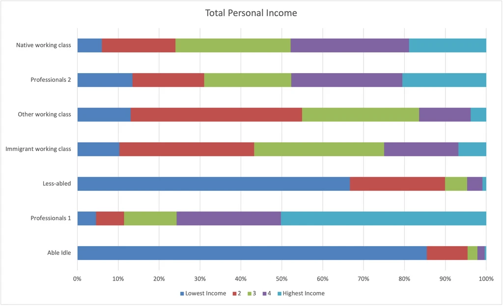
Total Personal Income
We’ve looked at whether respondents reported certain types of non-wage income, now we’re seeing which groups have relatively high/low incomes.
- The one strong surprise here is that the Professionals 1, which do only slightly better than Professionals 2 by most measures, are clearly out-earning Professionals 2 by some margin.
- The Native working class does a bit better than the Immigrant working class, and the Other working class does worst of all.
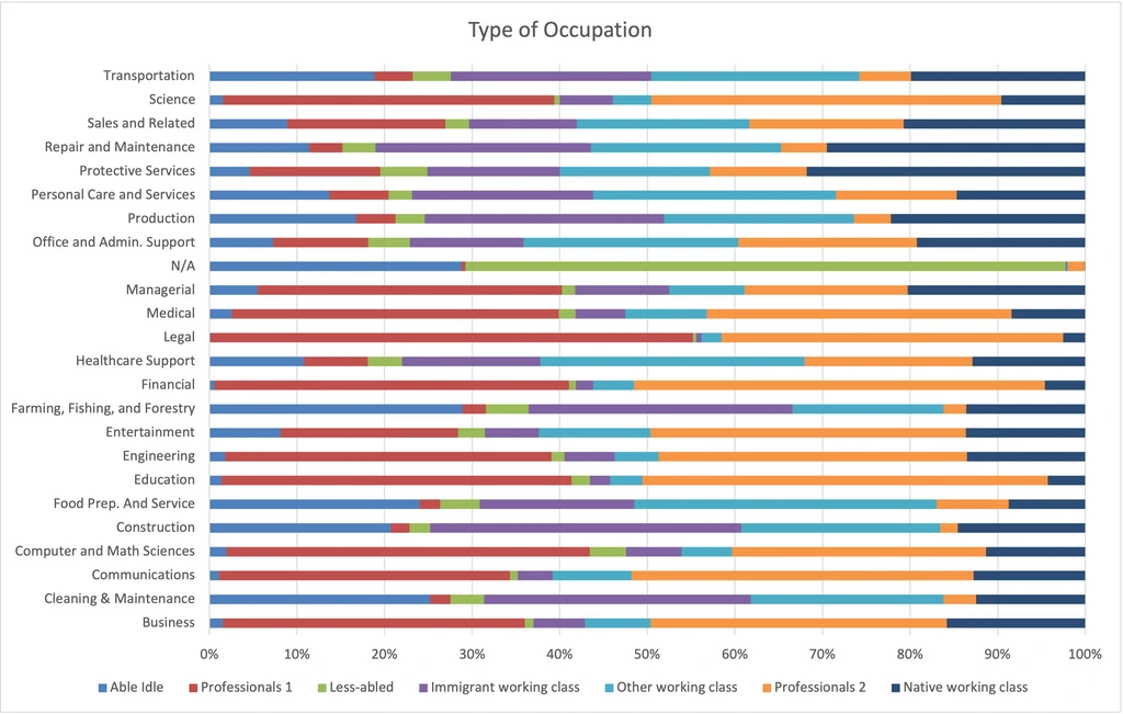
Type of Occupation
Now we’re looking at the type of work the person performs, not the sector in which they do it.
- Professionals 1 do significantly more Managerial work (24% vs 13%). Professionals 2 do twice as much Office/Admin Support work and Entertainment work.
- Immigrant working class does the most Cleaning & Maintenance and significantly more Construction (24% vs 10% for Native and 15% for Other).
- Native working class does slightly more Repair and Maintenance and twice the Managerial as the others.
- Other working class does the most Food Prep. And Service (7% vs 2% for Native and 4% for Immigrant).
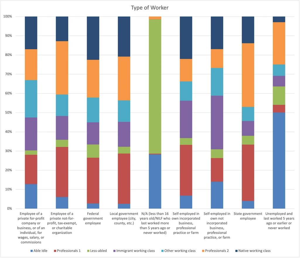
Type of Worker
- Professionals 2 are more likely to work for government or not-for-profits.
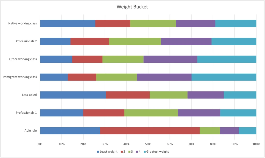
Weight
- Not to be rude, but Immigrant working class weigh the most and the Able idle weigh the least. We know from other data that people with higher incomes tend to weight less, but when taking a holistic view of socioeconomic status, we seem to discover a horseshoe effect.
Describing the Clusters
Having now looked at the data in detail, I’ll give some general descriptions of each group.
Professionals 1: These are married, college-educated men. Compared to Professionals 2, they work in similar sectors, are as likely to work from home, are slightly more educated, out-earn significantly, are significantly more likely to have a Managerial occupation, are more likely to report self-employment and interest/dividend/rental income, and have a higher health insurance rate.
Professionals 2: These are unmarried, college-educated men. Compared to Professionals 1 they are more likely to work in government or for a not-for-profit, are slightly more likely to have studied Mass Media, English, Design, etc., tend to be younger in age, and are more likely to be unemployed.
Native Working Class: These are men who did not complete college, are employed, and overwhelmingly were born in the U.S. and do not speak a second language at home. Compared to the other working classes, they are more likely to work in the Public Administration and Manufacturing sectors and have a Repair and Maintenance occupation. They have the most income of the working classes.
Immigrant Working Class: These are men who did not complete college, do speak a second language at home, and are employed. They are overwhelmingly hispanic and not native-born. Compared to the other working classes, they are more likely to work in the Construction sector and have a Cleaning & Maintenance or Construction occupation. They have a similar marriage rate to the Native working class, but less divorce.
Other Working Class: These are unmarried men who did not complete college and are employed. They are in-between the Native working class and the Immigrant working class in terms of nativity and whiteness, and compared to the two they skew the youngest. Compared to the other working classes, they are more likely to be employed in the Entertainment and Retail sectors and have a Food Prep. and Service occupation.
Less-abled: These are men who did not complete college, are unemployed or not in the work force, and are most likely to have a disability and receive Medicaid. Compared to the Able idle, they tend to have more education, and are more likely to be married. They’re about as likely as the Native working class to be a veteran.
Able idle: These are men who did not complete college and are unemployed or not in the work force. They tend to have lower income, lower body weight, and be incarcerated. They are overwhelmingly not covered by health insurance.
Key Variables
This analysis included 28 survey questions, and 288 question-answer pairs, but just a few do the heavy lifting. I ranked these question-answer pairs by how strongly they correlate with the cluster that the respondent were assigned to, and found that these were the most significant:
- Field of Degree - N/A (less than bachelor’s)
- Employment status - Civilian employed, at work
- Institutionalized - No. I possibly should have removed institutionalized people from the analysis.
- Means of transportation to work - Car, truck or van. I wonder if this is essentially a proxy for whether or not the person is employed or works from home.
- Educational attainment - 1 or more years of college, no degree. I was surprised that the exact level of educational attainment makes such a difference between the high school and Bachelor’s level, but it makes sense when you think about it.
- Total income - bucket #3. This is the middle bucket.
- Educational attainment - Associate’s degree
- Educational attainment - Regular high school diploma
- Language other than English spoken at home - No
- Health insurance - Has coverage. I feel like this may be a proxy for something else. I don’t think we’ve gotten to the bottom of the difference between the Able idle and Less-abled.
- Type of worker - Employee of not-for-profit. This may be one of the key ways to distinguish between the professions.
- Educational attainment - <1yr of college
- Type of Occupation - Repair & Maintenance
- Citizenship Status - Born in U.S.
- Total income - bucket #4
I was surprised that marital status didn’t make the top 15, since it seems like a clear wedge variable. I think it’s the main way to distinguish between the two professions, but most of the “work” of the classifier is in distinguishing between the non-professions, since educational attainment makes the professions so easy.
Lessons for Survey Design
After analyzing all this, these are the questions that I would include in a survey to allow me to efficiently segment respondents into socioeconomic groups.
- What is your highest education completed/started? Also use this answer to create a variable for whether or not they have a Bachelor’s degree.
- Are you currently employed? Maybe widen this to whether they’ve been employed in the last 5 weeks.
- Were you born in the U.S.? or Do you speak a language other than English at home? Both of those variables were influential, but I think we can get away with one. I think that asking about the language spoken at home is better.
- Do you have health insurance? This wedges between those who are employed but don’t have health insurance (eg. because they are self-employed or don’t receive benefits) and those who are unemployed but have coverage (eg. because they have a disability).
- What is your marital status? Even though this isn’t in the top 15, I’m attached to this variable and I think it’s important.
For many surveys, I would rather have this information about a person than their age, race, or income. I think that, as this analysis has shown, these questions can be combined to tell you more about the person’s place in the world than the standard characteristics.